Kaleidoscope of Creatures
Insight into the incredible illustrations by Greer Stothers

My name is Greer Stothers, and I am an illustrator who specializes in natural science illustration. This means I’ve worked for museums and paleontologists, but also work more creatively on projects introducing children to the natural world – like Kaleidoscope of Creatures, which explains animal colourations to young readers!
The main question outsiders usually ask about science art is “why not just use photographs?” Illustration and photography are different tools, so it’s a bit like asking “why not use a hammer?” to someone screwing in a nail.
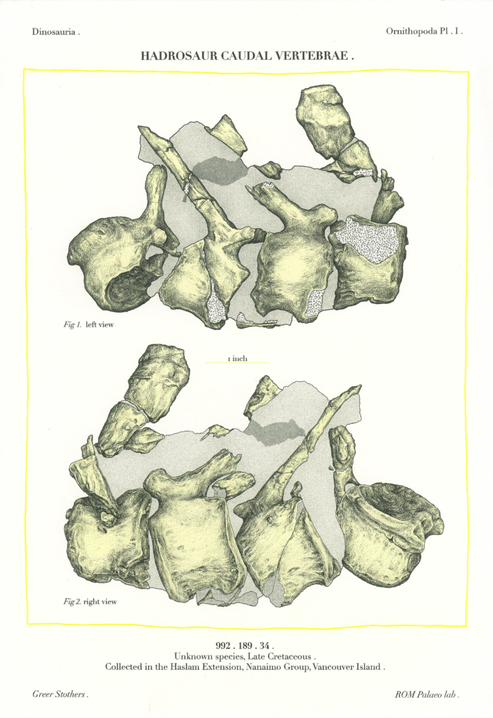
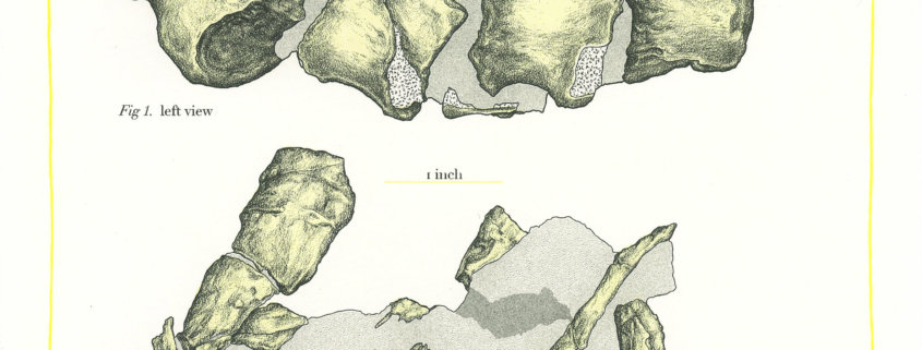
Illustration is useful for science because it tells you where to look. Photographs often have a confusing amount of detail – for instance, the camera doesn’t know that the rock matrix isn’t important, only the fossil embedded in it, so it will all be shown in the same HD clarity. As well, even high-quality lighting set ups may cast shadows that obscure key areas and distort shapes, and the background will have to be kept as monotone and untextured as possible to avoid competing with the subject.
By removing unnecessary detail, a science illustration can show you the fossil more clearly than a photograph, and more clearly even than your own eyes.
The children’s book, Kaleidoscope of Creatures, isn’t meant for scientists, but the illustrations are used in a similar way. Extraneous detail is cut out, to better focus on the main point. The book is about colour and pattern, so the animals are simplified down to just that.
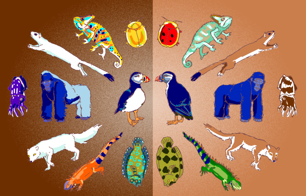
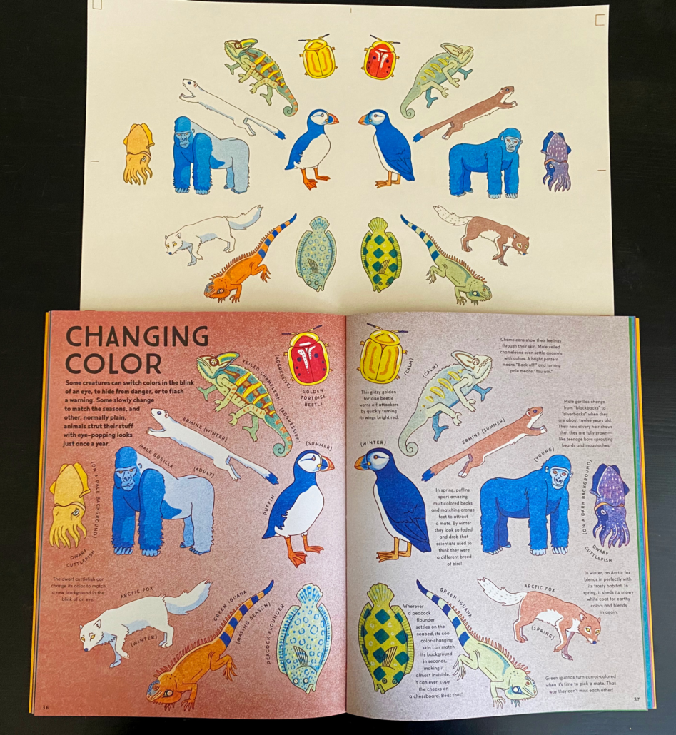
Now, onto how the illustrations were actually made! First, everything was sketched digitally. The book required the animals to spread out in kaleidoscope formations, which was usually accomplished by mirroring the two sides. In this spread (Changing Colours) mirroring was easy, as it’s about animals that change colour over time, and in most cases their lineart could be re-used.

The next step was trickier. Risographs are made by pushing inks through stencils to mark a paper, so using the digital sketch as a guide, I made stencils for yellow, red, brown and blue inks. I’ve misaligned them here, so you can see how they separate. I’ve also artificially coloured them – the risograph stencils sent to be printed were in greyscale.
Risograph printers read stencils in black and white, with the black signalling that 100% of the ink should pass through, and white signalling that 0% of the ink can pass. A grey that is 75% as dark as black will let 75% of the ink through, etc. The risograph printer punches tiny holes in the stencils to allow the ink to pass, so the final effect looks almost like pointillism.
Risograph inks are transparent, so you can print one of top of another to mix the colours. For instance, layering a 50% yellow stencil over a 30% blue will result in a bright, vivid green!
Once everything was printed, the last step was scanning it and assembling. The animals were printed separately from their backgrounds, so the white paper behind them had to be digitally cut out. As a final step, I digitally separated each animal onto a named layer, to make it easier for the person adding the text and labels to the spread.
And then, it was out of my hands! The design team did a fantastic job arranging the text around the animals, bringing everything together.
I hope this book does its job of getting little budding scientists interested in the amazing natural world around us! There’s so much diversity to explore, and this just a starting point.


Leave a Reply
Want to join the discussion?Feel free to contribute!