

We Were Wolves: Combining story-telling and illustration
By Jason Cockcroft


I grew up reading comics. They were my biggest influence
until I was around fourteen. This was before modern sophisticated colour
printing became affordable to publishers, but I found something particularly
emotional and dynamic in black and white work created in pen and ink that I
didn’t recognise in colour illustration. Wonderful artists like Brian Bolland,
Mike McMahon, Dave Gibbons and Carlos Ezquerra, who all worked for 2000AD in
the UK at the time, and US comic artists such as Gil Kane, John Romita Jr. and
Neal Adams were my touchstones. Later, I fell in love with Harry Clarke, Aubrey
Beardsley and Arthur Rackham’s line work. Later still came Charles Keeping, and
both his linework and colour work remains a revelation to me, and I hope I
managed to emulate some of his boldness and grace in my book, We Were
Wolves.
Although it isn’t an autobiographical story, the theme of
love between a father and son was and is very personal to me. I wrote the first
draft with no intention of creating an illustrated book. When writing, I rarely
think in visual terms. It was only when I was having conversation with
potential publishers that we discussed the idea that we could design the book
to be a beautiful object, something that would draw the reader in visually, and
could integrate both my fiction and artwork.

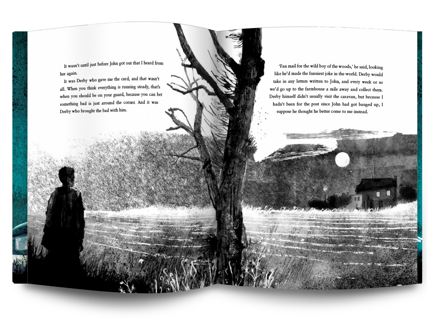
One of the features of We Were Wolves as a story, is the mix of an ancient mythology (in the book, these myths are a creation of John, the father, which are then told to his son), involving prehistoric creatures and legendary and extinct animals, with a very realistic, gritty world that straddles both the small market town in the north, where the boy has lived with his mother before the events of We Were Wolves, and the woods outside town, where he now lives with his father in an abandoned caravan. These elements could be seen as magic realist, but I wanted to avoid romantic portrayals of such elements, and present the creatures of the boy’s imagination as realistically, and with as much texture and detail as the surrounding ‘real’ world. They had to grow organically from both the urban and natural environment. I worked on paper with a variety of dip pens and filter pens, pens for calligraphy, and technical pens, as well as creating new textures using fabrics and man-made materials to print patterns, and relief prints of leaves and even potato prints. There are scattered tea leaves and diluted coffee in the mix, too. Then all the different elements were scanned and placed together in a Photoshop document, like a collage. I wanted the overall effect to be dense and detailed and layered, so the images were immersive in some ways, drawing you in, dream-like, to the boy’s world, both real and imagined. Editing proves often to be the most important part of a writing process, and for me it’s the same with illustration. In this case, having piled detail and texture onto the original line drawings, to create shadow and depth, I then had to shape the image again, discover it, almost like an exercise in excavation, pulling back the detail until the image was readable again. You get lost, and then – after plenty of work – you find that you have arrived, sometimes having to a dig out a path to discover exactly where it is you have arrived. That’s the joy of illustration.
We Were Wolves – Written and illustrated by
Jason Cockcroft
Released 6/5/21
Hardback
£12.99


Leave a Reply
Want to join the discussion?Feel free to contribute!